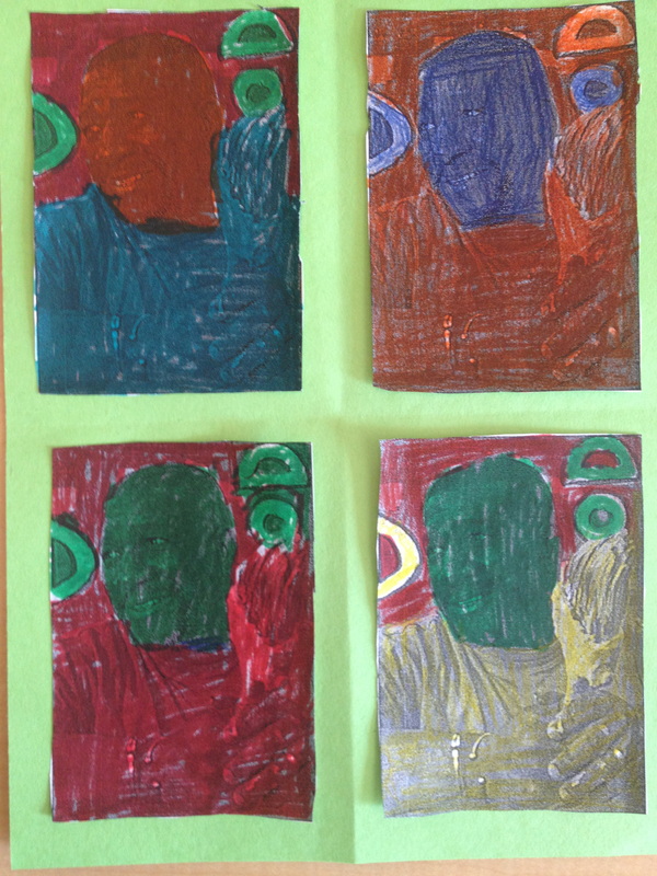
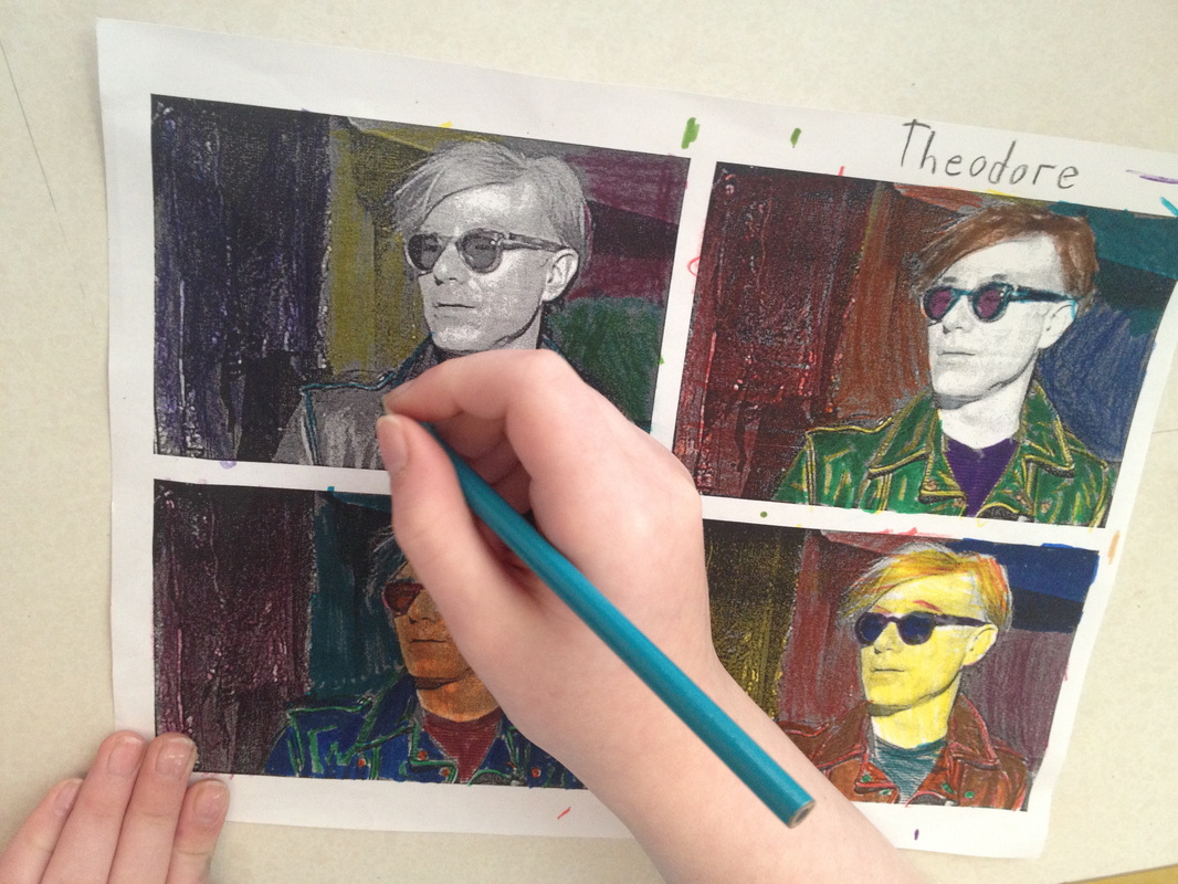
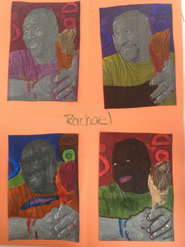
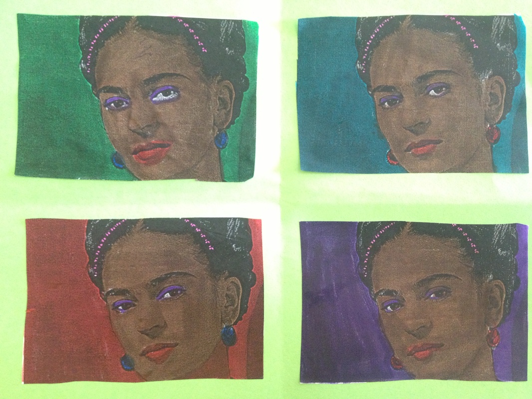
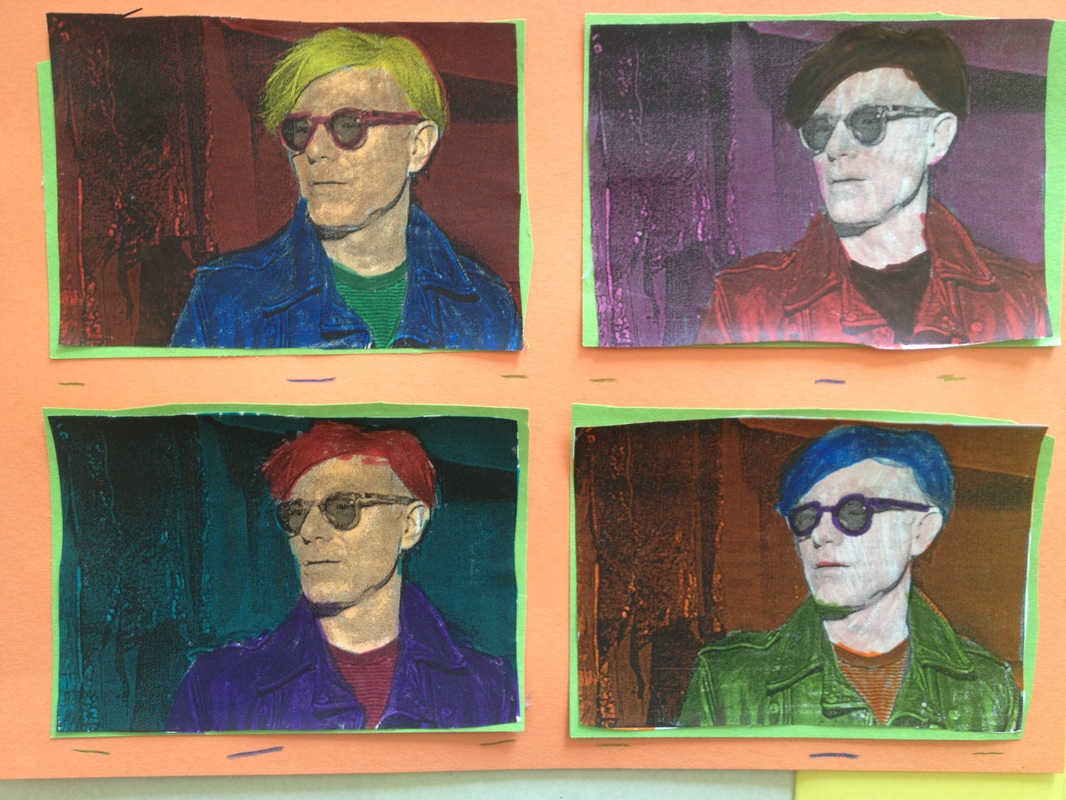
| Art Era: 1960's Art Movement: Pop Art Featured Artist: Andy Warhol Grades: 3rd grade - 5th grade Key Vocabulary: pop art, complimentary colors, photography, portraits, self- portraits, markers, highlighters, color wheel, background, and andy warhol. Cross curricular connections: Fractions (math) |
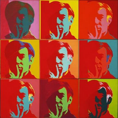
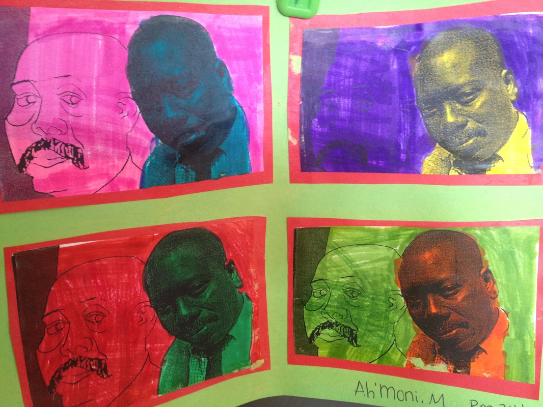
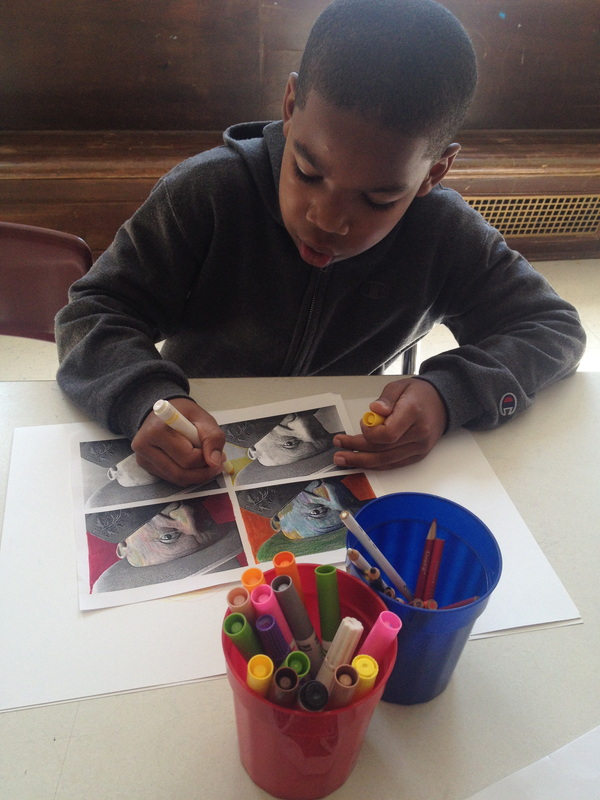
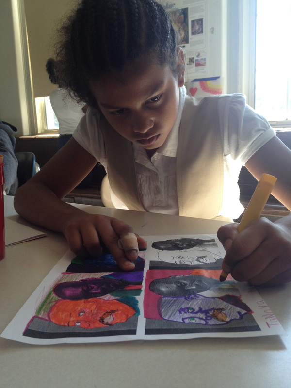
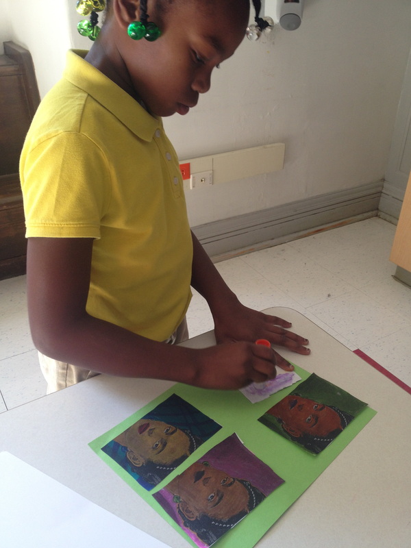
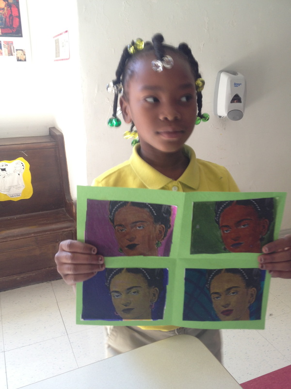
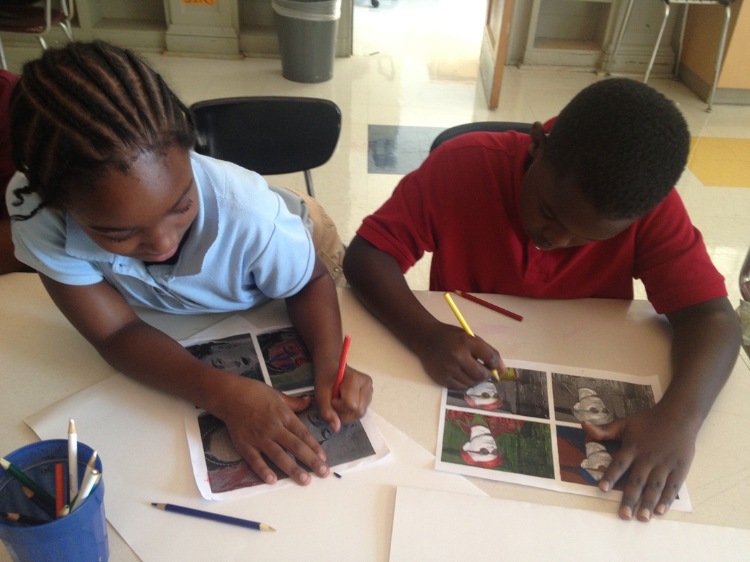
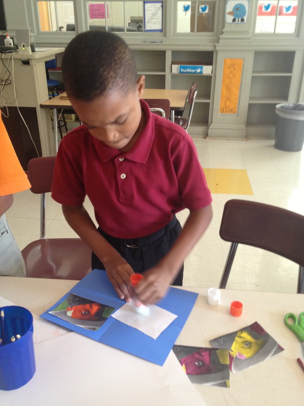
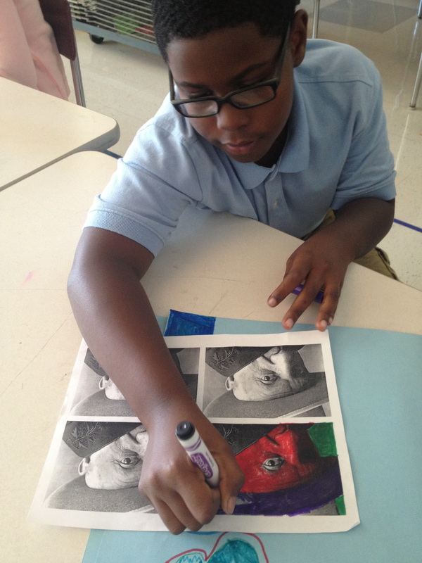
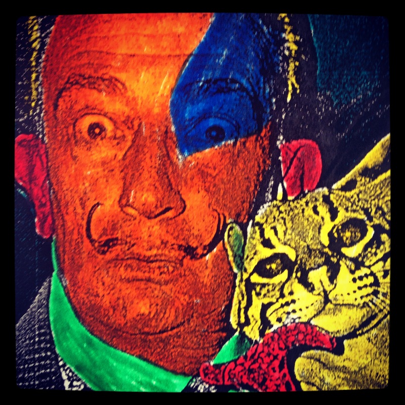
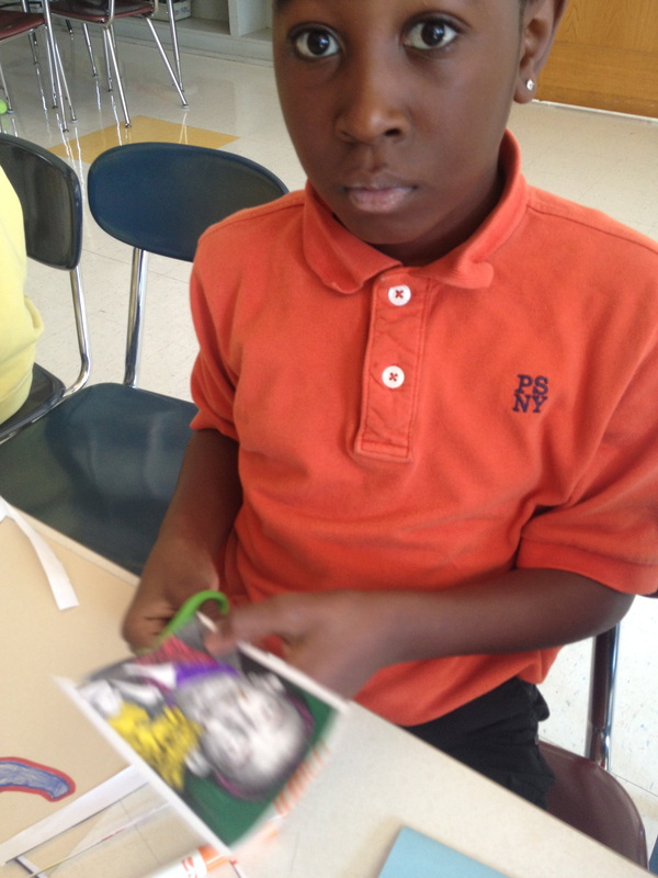
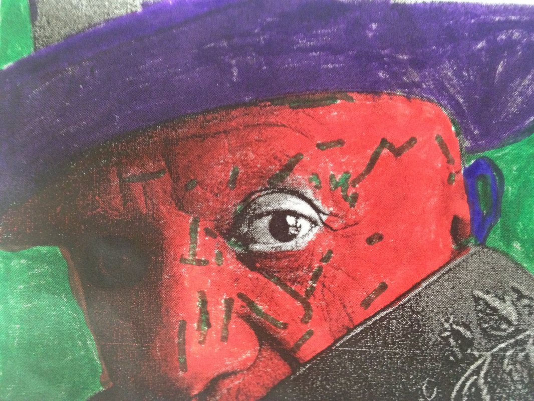
For the past three weeks students in 3rd, 4th, and 5th grade have been learning about pop art. Our first stop in the art history time machine was to the 1960's where Andy Warhol began his pop art phase. Pop Art is art made from commercial items and cultural icons such as product labels, advertisements, and movie stars. In a way, Pop Art was a reaction to the seriousness of Abstract Expressionist Art. Pop Art is meant to be fun. After building our background knowledge on pop art and the artist Andy Warhol, students where challenged to create their own work of pop art using Complementary colors. Complementary Colors: Two colors on opposite sides of the color wheel, which when placed next to each other make both appear brighter. For example, the complementary color for red is green, for blue it's orange, and for yellow it's purple.


 RSS Feed
